October 26, 2009

autumn colors

8 x 10, oil on canvas
My aim is to avoid overworking the canvas, capture what I see and leave it alone.
WHY is that so tough? (eek)

"Wherever the great dilemma exists is where the great growth is, too. It would be very nice for nervous types like me if things were black and white, and you could tell where one thing ended and the next thing began, but as Einstein taught us, everything in the future and the past is right here now. There's always something ending and something beginning"...Anne Lamont

October 22, 2009

falling for you

8 x 10... back to painting in plein air--what could be more inspiring than the colors of fall?

"That moment--the first time you fall in love with art--it has a huge impact on you.
In a sense, you're always looking for those moments"...John Cusack (describing the first time he read
"To Kill a Mockingbird")

October 13, 2009

a bold commitment

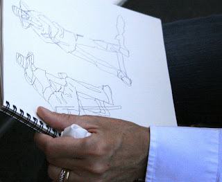
In the last of the workshop posts, I am including this photo of Peggi sketching. She urges students to always have a sketchbook handy, ideally fill at least one sketchbook a month, and only sketch with a bold marker. Sketching with a pencil, she explained, does not force you to make the necessary commitment to the page in the same way as the marker does. The idea is to keep the marker on the page once sketching has begun, and like blind contour drawing, focus more on your subject while you draw than your drawing. Peggi Kroll Roberts is a wonderful teacher; I highly recommend her; hope you have enjoyed this series.
“The relationship between commitment and doubt is by no means an antagonistic one. Commitment is healthiest when it's not without doubt but in spite of doubt"...Dr. Rollo May

October 10, 2009

minimal brushstrokes


(340)The challenge involved in these studies is the use of minimal brushstrokes. Colors are mixed beforehand; each brushstroke and color change is planned. Every time the brush is lifted from the canvas counts as one brushstroke, so loading the brush with as much paint as possible, is key. It is possible to do an entire painting in 30 strokes or less. (Oh yes it is). The brushstrokes are counted with spots of color on the bottom of the painting. I painted the model at the workshop but did the other two exercises after I got home because it is THE MOST FUN exercise ever. If you have never tried it, you must! It can be a great "warm-up" exercise, but most of all, it teaches you to really see your subject and count/plan how many different color/value changes (large and small) you will need.
"Many of the most powerful paintings have the simplest value structures. That is to say, they only use two, three, or four major values"...Barry John Raybould

October 7, 2009

high key

This assignment was to keep contrasts to a minimum by choosing the value of the darkest dark, (no darker than a mid-tone), and then keying all other values lighter accordingly (no matter how dark they appear in life).
"Value choices are intuitive... It's fun to see how much you can get without leaning on contrast"...Sara Genn

October 5, 2009

black in sunlight

So what happens to the color black in sunlight? It can appear very bleached out, so our model wore white shorts to contrast with the black t-shirt, and sat in half sun/half shade. This pose allowed us to study the rule stating that "The lightest dark cannot be darker than the darkest light". In other words, the sunlit side of the black t-shirt (the lightest dark) cannot be painted to appear darker than the shadow side of the white shorts (which are the darkest light). It sort of sounds like a tongue twister the first time you hear it, but seeing, comparing, painting this subtle difference can make or break a painting.
"Establishing the two most extreme values as soon as possible helps me take note of all other values that will fall somewhere between them"...Kenn Backhaus

October 3, 2009

the light family


This focus of this quick-study was to examine just how difficult it can be to see the correct values in areas bleached out by sunlight. The white pillow on the right side of the bench should be the lightest light, but as you can see in the top photo (blurred to reduce shapes and see values easier) the model's dress on the left, and both hats appear very bleached out too, almost as light as the white of the pillow. So the artist must continually compare everything to the lightest light (white pillow) and keep the other lights toned down. To test if the values work, I desaturated the color to B&W on the computer for the bottom image, making it is easier to see.

"Color is an inborn gift, but appreciation of value is merely training of the eye, which everyone ought to be able to acquire"...John Singer Sargeant

October 1, 2009

matching values


Like the previous post, I painted a value study before moving on to the color study. To test how values will match, spots of the color can be placed directly on top of the monochromatic study, as shown above. (Or, if you prefer, a plastic coating like saran wrap can be wrapped over the value study to protect it while the colors are matched).
"You get your color with your eyes open, your value by squinting"...Martha Saudek